
Meeting Brian Willson, creator of historical typefaces
Handwriting conveys far more than words. It evokes a period, a place and sometimes an entire story. A conversation with Brian Willson, designer of historical typefaces.
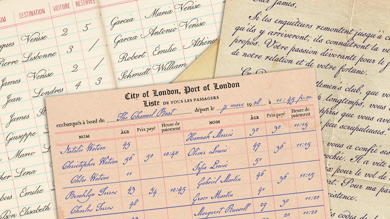
A handwritten letter doesn't only communicate what is written on the page. Its paper, ink and handwriting already tell us something about the world it comes from.
That's why typography plays such an important role in the creation of fictional documents. A convincing typeface can be enough to make us forget that a document was designed today.
This is precisely what makes Brian Willson's work so valuable. I discovered his typefaces through Annie Atkins while attending a graphic prop design workshop in Dublin. Since then, they have become an essential part of many of the fictional documents I create.
I had the pleasure of speaking with Brian about his career, his inspirations, his creative process and his fascination with historical handwriting.
The foundation: real historical handwriting
Originally from Austin, Texas, Brian Willson has always been drawn to nature, history and handwriting.
He began his career as a newspaper journalist (just as I did) before unexpectedly finding his way into type design.
"I never studied type design. But in 1993, while working as an editor for a trade magazine, I admired the art director's handwriting. I asked if I could turn it into a typeface. She wrote out uppercase and lowercase alphabets, numbers, punctuation and symbols on a large sheet of paper, and I figured out how to scan, trace, scale and refine the characters. The result became my first typeface, Marydale."
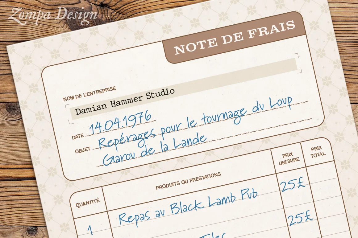
Only a year later did he create his first historical script.
"In 1994, while working on one of the early Macintosh computers, I needed a vintage cursive typeface but couldn't find one. Since I had already designed three typefaces, I decided to create my own. At the time, my mother worked in a historical library, so I asked her to send me photocopies of old handwriting samples. She mailed me copies of letters written by several well-known Texans from the early and mid-1800s."
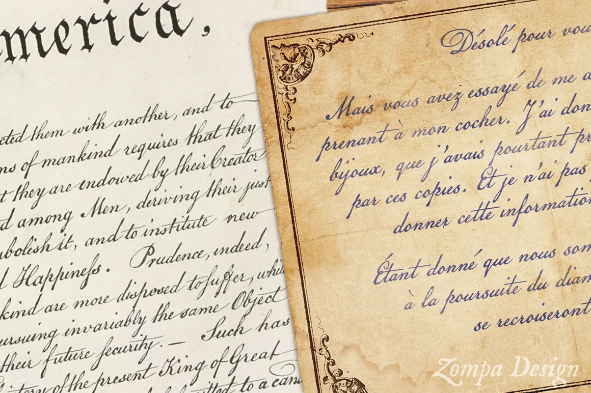
His first historical script, Texas Hero, proved successful and was soon followed by Schooner Script, inspired by a handwritten letter from a Massachusetts pastor discovered in an antique shop. One of his best-known creations, American Scribe, faithfully recreates the handwriting used in the United States Declaration of Independence.
A craft of patience and precision
Designing a historical typeface requires countless hours of careful observation and refinement.
"First, I select the best examples of each letter from the historical manuscript I'm using. I then scan or import each character into Photoshop, where I painstakingly trace every letter as vector artwork. Once every character has been drawn—hundreds of them—I import everything into FontLab. That's where the real work begins. I adjust every glyph to a consistent size and carefully refine the spacing so the cursive connections flow naturally. By the end of the process, every character has been tested against every other character, on both sides."
One feature I particularly appreciate in Brian's work is that many letters exist in multiple alternate versions.
This allows me to avoid the repetitive appearance often associated with digital fonts. By manually substituting certain characters, a document regains the natural irregularities of genuine handwriting.
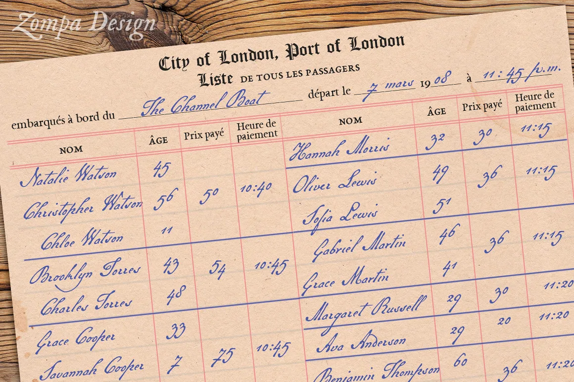
"One of the most rewarding aspects of my work," Brian explains, "is seeing my fonts appear in so many different contexts: wine labels, historical book covers, games and more. My clients also include historical reenactors and graphic designers working in film and television. Those are definitely some of the coolest places my typefaces end up."
Brian Willson's work is a reminder that handwriting is never simply an aesthetic choice.
It contributes to the credibility of a document just as much as its content or the material it is printed on.
Very often, it is these almost invisible details that make a fictional world feel believable.
You can explore the complete Three Islands Press type library at 3ipfonts.com, as well as Brian's collection of historical typefaces at OldFonts.com.