
Journal
A fascinated look at the details that bring fictional worlds to life
-
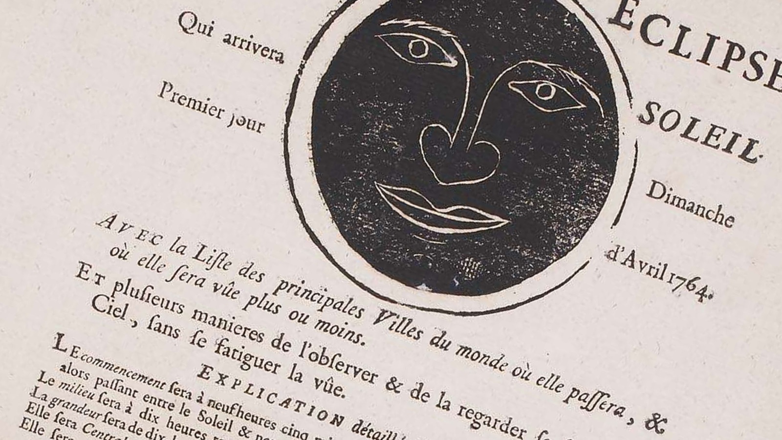
Observing an eclipse in 1764: what a 18th-century poster can tell us
A few hours before the Moon passes in front of the Sun on Wednesday, August 12, 2026, the French National Archives shared a poster on their social media that immediately caught my attention.
Read → -
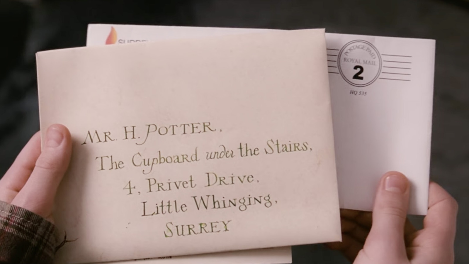
What cinema taught me about graphic props
In film, printed matter, signage and fictional documents can tell as much of the story as the sets themselves. A closer look at the graphic details that give fictional worlds their coherence and believability.
Read → -
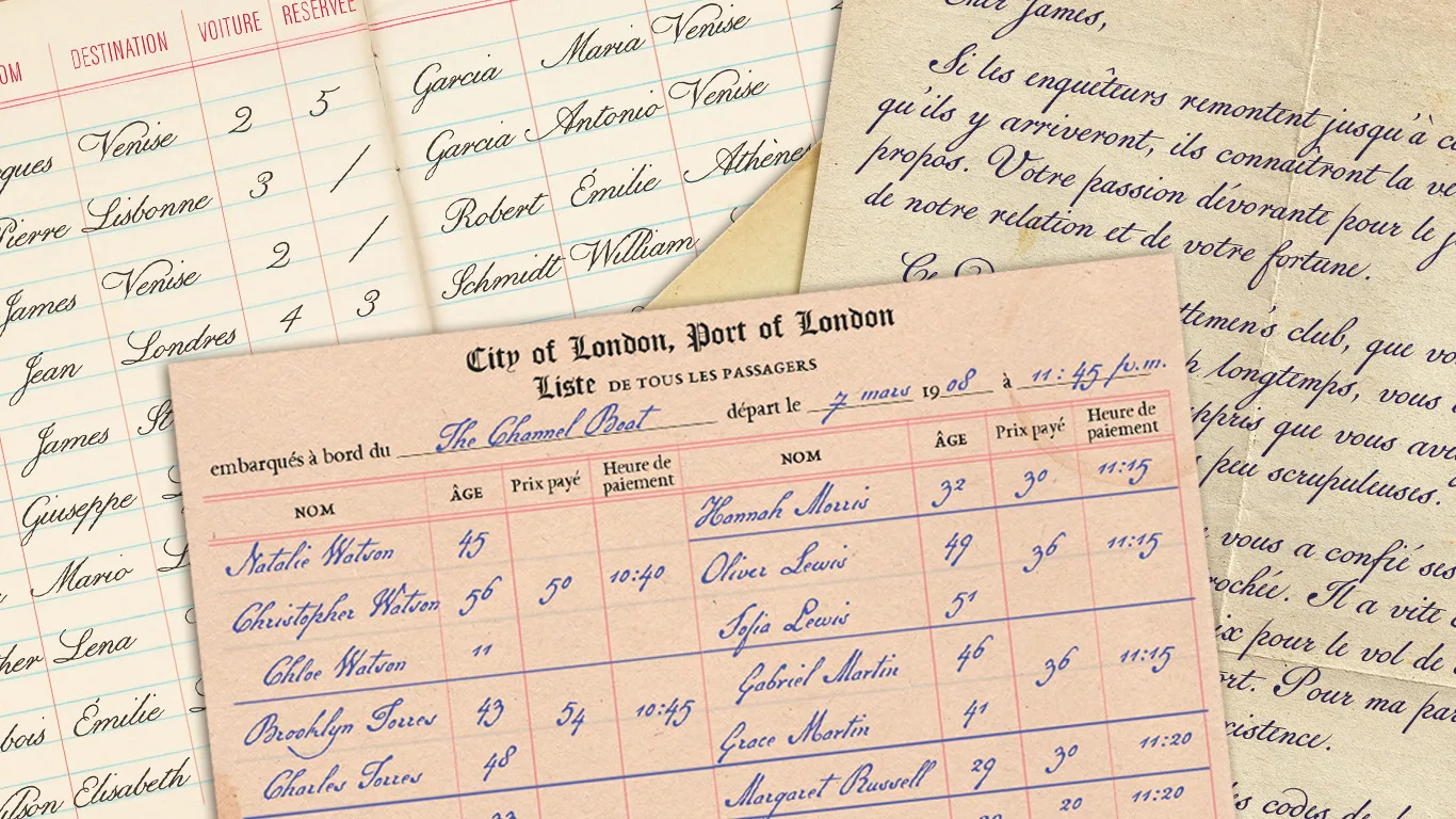
Meeting Brian Willson, creator of historical typefaces
Handwriting conveys far more than words. It evokes a period, a place and sometimes an entire story. A conversation with Brian Willson, designer of historical typefaces.
Read →